
But a fun and fulfilling one, for sure.
For my latest self-published novel, The Lek, I used Fiverr to find a designer to make the book cover.
Fiverr is a fantastic resource, by the way. You can find pretty much any kind of freelancer on there. Ghostwriters, copywriters, video editors, animators, songwriters, voice over artists, programmers, beta readers, and consultants in virtually any field.
I’d used Fiverr before for my first novel, Nemesis. A story about a middle-aged suburban father who’s contacted by a mysterious organization with a strange offer: To eliminate one enemy in his life. The choice is easy. He has his abusive father, now elderly, and in a retirement home, killed in clandestine fashion. It all seemingly goes according to plan. Until his estranged twin sister, a paranoid schizophrenic, shows up, determined to take him down and get justice for her father’s murder by any means possible.
Nemesis was a darkly humorous psychological “suburban thriller” in the vein of the 2015 Jason Bateman film, The Gift, or Scott Smith’s brilliant and intense 1993 novel, A Simple Plan. I’ve always been drawn to stories with fiery family dramas, interpersonal conflicts from the past left unresolved, or that involve some kind of moral dilemma. David Cronenberg’s 2005 film A History of Violence probably encapsulates everything I look for in a smart thriller.
I’ve found that most thriller book covers tend to be pretty basic. Nemesis was my first self-published novel. So I went with something straightforward.

I think the results were acceptable. I didn’t exert much scrutiny toward the design. It was my first experience hiring a designer on Fiverr. I didn’t really know what to expect. And I hardly communicated much of a “vision” for the design.
Good communication is very important when working with a designer.
You can’t expect a stranger to just intuititively know what’s in your head. This was a learning process for me, who, like I suspect many writers, has a bad habit of getting stuck in my own throught process.
The Lek cover proved a challenge. In contrast to the more grounded Nemesis, The Lek is a trippy, irreverent and provokably profane dystopian satire about a deadly contest where males compete for reproduction rights with a female.
For more details, check out the article I wrote on The Lek here.
For that kind of bizarro concept, I needed a cover that really communicated the weird, wild, and exotic environment of an X-Rated story filled with a lot of sex and violence.
While writing The Lek I drew on inspirations from such dystopian favorites of mine like Anthony Burgess’ A Clockwork Orange, Harlan Ellison’s A Boy and His Dog, as well as Stephen King’s The Long Walk and The Running Man. So naturally, I wanted a cover that not only evoked the elements of the story, but that era as well. Sci-fi book covers back in the ’60s and ’70s used to be awesomely psychedelic and high-concept, especially for authors like Kurt Vonnegut and Philip K. Dick. It truly was an experimental age.
Of course, communicating that vision proved tricky. Not everyone will vibe with that. It really is interesting how different artists will interpret your ideas for a cover in their own unique ways. This led to a few false starts before getting to the type of cover I wanted. But I enjoyed the whole process, and I found it a good learning experience.
It also helped get me out of my comfort zone. As a writer, it’s so easy to get used to working alone, and doing your own thing. But there can be a lot of components that go into content creation, whether we’re talking writing freelance articles, copywriting, or self-publishing a book about twelve dudes trying to win a deadly contest so they can bang a hottie.
There’s also marketing, which is something I’m just now beginning to learn about. It’s embarassing how little I know about it, but I’m trying to change that. The actual physical discipline of producing the written word I’ve never had an issue with. I know how to smash words out, baby. It’s getting those words out in front of people— selling myself — that I’ve always struggled with. But that’s for another article.
Anyway, here are a few designs I considered before getting to my chosen one. I thought it would be interesting to go through the book cover selection process of self-publishing. Feel free to tell me what you think of each one.
The first design team I went with was based overseas, and had a lot of attractive samples on their Fiverr profile page. They actually produced two samples based on my ideas for something trippy and ‘70s-era sci-fi-ish.
Cover Attempt One:
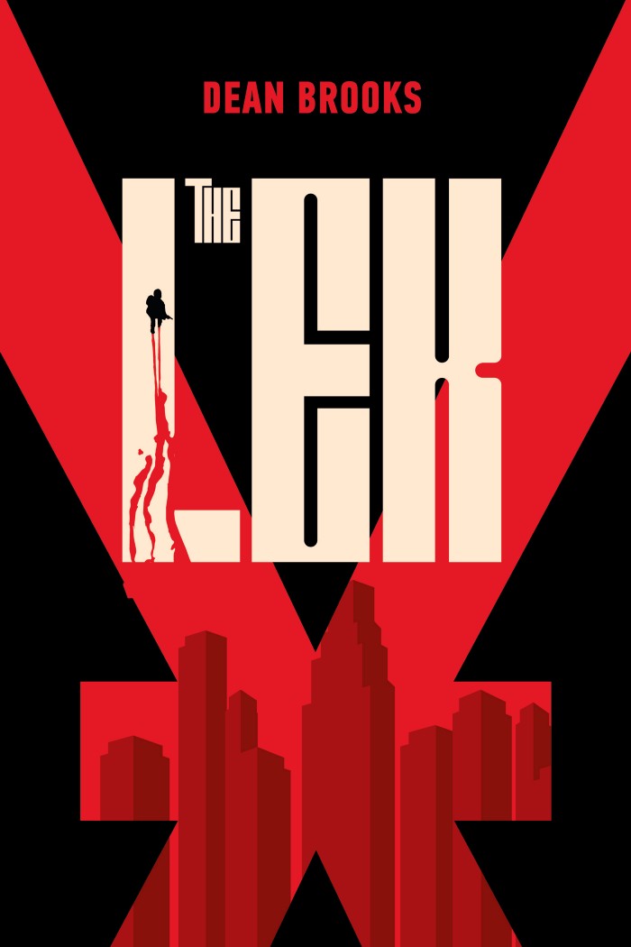
I didn’t care for this cover at all when I first saw it. Then I kind of warmed up to it a little bit. It captures the bloody nature of the Lek gauntlet contest that occurs in the book. There are a lot of creative kills as the males are picked off over the course of the story.
This cover also indictes the thriller aspect of the story, à la King’s The Long Walk. The deep ruby red hints at not only the intensity, but the violence, and maybe even a little bit of the dystopian nature. I did like the “X,” as a subtle reference to the name of my name character, or as perhaps a symbol of the the Lek contest itself.
This rendering certaintly has a few good things going for it. The problem is that it’s far too serious. It doesn’t evoke the main genre — satire. Doesn’t hint at the dark humor, or the weird playfulness of the concept, much less the sexuality throughout the novel. It’s certainly not trippy or ‘70’s-ish. A cover like this indicates more of a straightforward thriller. It makes me think Robert Ludlum, Frederick Forsyth, or even Tom Clancy.
Plainly put, it misreprents the story.
This is the challenge when working with graphic designers through a freelance website as an indy author. Unlike with a traditional publishing outfit, where the in-house staff has read your book, and likely knows how to convey your wacky-ass idea in a cover design, you won’t necessarily have that luxury through Fiverr. It’s a bit more hands on.
As for the second cover sample, it completely missed the mark.
Cover Attempt Two:
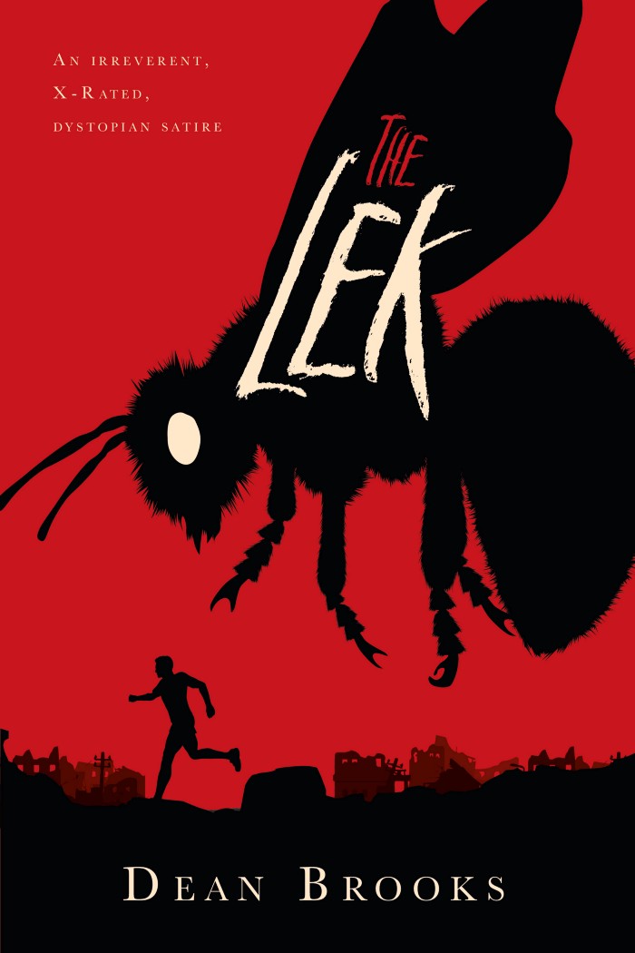
About the only thing somewhat redeemable about this cover is the apocalytpic background with the collapsed buildings. Other than that, it doesn’t work at all, as it evokes a 1950’s-era monster movie type story like Attack of the 50 Foot Woman, Attack of the Crab Monsters, or Tarantula!.
This is an example of where sometimes a designer can take things too literally from a description or from the ideas you submit. In my story, the title of the female the males are competing for is “Queen Bee.” And not just because she’s the most beautiful and desirable female in the Lek’s history. But because, as the title suggests, she’s expected to reproduce prodigiously with her Lek winner to help repopulate the earth. There is not an actual killer bee chasing any of the males. And the cover doesn’t work as a visual metaphor either, as none of the men are running from the contest, but indeed, quite excitedly toward it, grisly potential deaths be damned. So, like the first cover, this one misrepresents the story.
After rejecting these two samples, I realized something. I was going to have grab the bull by the horns here. See, up until this point, I’d been merely communicating a general idea — the gist — of what I wanted. I figured that would be enough. But that’s hardly fuel adequate for a designer. You need specifics. You need a clear visual with details. Basically, you’ve got to do everything but draw the damn thing yourself.
All the designers I messaged on Fiverr were talented artists. But designers on there are also time-constrained. The impression I got was that they would prefer to simply be told specifically what to make, rather than brainstorm ideas for the cover. Other designers on there may work differently, but that was the experience I had with the ones I dealt with.
To be clear, all of the struggles I encountered were 100% my fault due to inadequate communication.
Even though I was still pretty new to the cover design game on Fiverr, I definitely could have done a better job articulating what I wanted. I certainly will in the future.
It also doesn’t help that I’m a habitual maximizer. But, that too, is for another article.
After climbing up that learning curve, I decided to finally try out an idea I’d had, but remained a little hesitant about revealing. I thought about why exactly I was drawn to the psychedelic ‘70’s-era book covers for my novel. It was the experimental, carnival tone that they conveyed, mostly. It was also how many of them really took advantage of their out-of-left-field concepts by illustrating something striking and different. As opposed to your standard cover for a thriller novel of a guy running, or a dude holding a gun or something.
They also tended to use simple visual metaphors to represent the central conceit of the story. Oftentimes, in a minimalist manner. Minimalist book covers are a whole sub-category unto themselves. There are a lot of artists on Fiverr who specialize in those. Here are a few examples of what I’m talking about.
For The Lek, I didn’t think a minimalist take would work, though I was drawn to the design aesthetic initially. So instead, I went with something a bit more audacious.
The Final Cover:
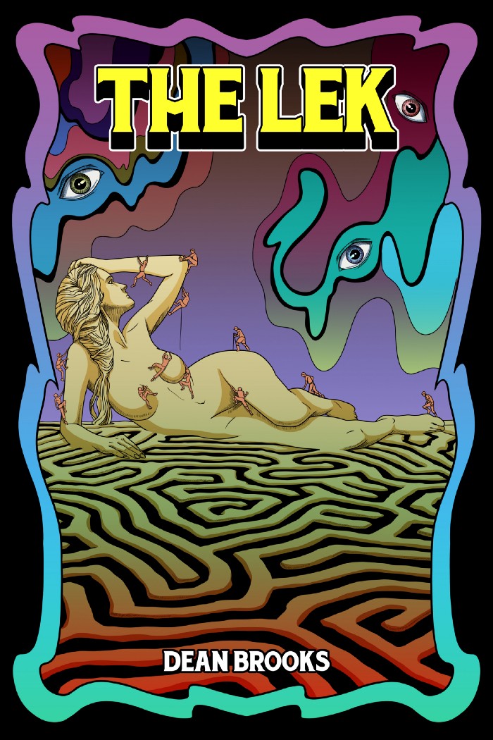
I really like this cover because it conveys the tone, conceit, genre, and humor of the novel pretty, well, starkly. It’s colorful without being too garish or clashing. It gives a sense of playfulness and adventure while hinting at some of the dark themes. It also subtly pokes fun at the takes-itself-too-seriously Young Adult dystopian sub-genre that my novel satirizes. Most importantly, it sticks the sexuality front and center.
Overall, I found the process of coming up with a book cover more challenging than I anticipated. It’s strange how I have no problem writing tens of thousands of words imagining all sorts of crazy scenarios, but developing a cover proves problematic. The whole ordeal helped me to be more appreciative of design artists, and showed me the importance of good communication when sharing my ideas. The book cover step in self-publishing may not be the most important. But it is a crucial one. At least next time it shouldn’t be as formidable.
